
Router Extra Options
May 4, 2021
A Simple And Powerful Git Version Control Workflow
May 31, 2021
When working on a project, there will come a time in the development process where the client wants their data to be displayed as graph.
There are various ways on approaching graph implementation, depending on the project’s code structure. In this blog, I will be providing a tutorial on how you can implement a basic and dynamic doughnut graph using a Vue component.
Index
- Setting Up Components
- Component Definition & Data Binding
- Parent Components
- Child Components
- Circle & Shadow
- Graph Percentage & Label Position
Setting up Components
Before starting, you will need to install the following if not already included on your project:
- Chart.js - npm install chart.js --save
- Vue-chart.js - npm install vue-chartjs –save / npm install vue-chartjs chart.js --save
- Vue - php artisan ui vue & npm install
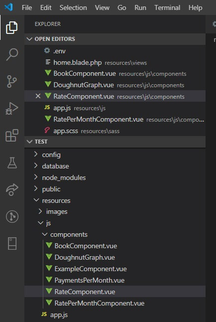
When the extensions above have been installed, you will need to create the following main vue component files within resources->js folders
- DoughnutGraph.vue
- BookComponent.vue
Ensure that the vue components are properly referenced in the app.js file, which is also located within the resources folder.
Component Definition & Data Binding
App.js
require('./bootstrap');

import Vue from 'vue';

Vue.component('DoughnutGraph', require('./components/DoughnutGraph.vue').default);
Vue.component('rate-component', require('./components/RateComponent.vue').default);
Vue.component('book-component', require('./components/BookComponent.vue').default);
Vue.component('rate-per-month-component', require('./components/RatePerMonthComponent.vue').default);

const app = new Vue({
el: '#app',
});
The first file that we need to focus on is the .blade file, where we will be adding the parent components. At this point of development process, you would have already created a controller that retrieves data from the database.
In the following section of code, you will see an example of how you can approach the implementation of the component and the binding of data on the .blade file.
Example.blade
@extends('layouts.app')</p>
<p>@section('content')</p>
<div class="container container-dashboard">
<div class="row justify-content-center">
<div class="col-md-4">
<div class="card">
<book-component :book-pending={{$counts['in_progress']}} :book-completed={{$counts['complete']}} ><br />
</book-component></div>
</div>
<div class="col-md-4">
<div class="card">
<rate-component :rate-first-amount={{$maximum_amount }} :rate-second-amount={{$current_amount }} ><br />
</rate-component></p>
</div>
</div>
<div class="col-md-4">
<div class="card">
<rate-per-month-component :fixed-rate={{$subsciption_table->fixed_subscription_rate}}<br />
:first-rate={{$subsciption_table->cost_per_item * $rate_one}}<br />
:second-rate={{$subsciption_table->cost_per_item * $rate_two }}<br />
:next-monthly-rate={{$subsciption_table->fixed_subscription_rate + $subsciption_table->cost_per_item * $rate_two + $subsciption_table->cost_per_item * $rate_one}}<br />
><br />
</rate-per-month-component></div>
</div>
</div>
</div>
<p>@endsection
Parent Components
Before creating the parent components, I will briefly explain what type of data will be displaying for these examples.
- For BookComponent, it will be counting the number of books that consist the Completed and Pending status on the database.
- RateComponent will be used to display the total amount rates that have been defined and summed up in the controller.
- MonthlyRateComponent will display the fixed rate for Rate 1, the cost per rate for both Rate 2 and 3, and the total rate for all three combined.
BookComponent.vue
<template></p>
<div id="app">
<DoughnutGraph :graphText="graphTextContent" :data="chartData" :options="chartOptions" class="doughnut_graph"></DoughnutGraph></p>
<div class="col-10 ml-3">
<p><b class="graph_total_option_1">Total Books Completed:</b> {{BookCompleted}}</p>
<p><b class="graph_total_option_1">Total Books Reading:</b> {{BookPending}}</p>
<p> </p>
</div>
</div>
<p></template></p>
<p><script>
import DoughnutGraph from './DoughnutGraph'
export default {
name: "BookComponent",
components: {
DoughnutGraph
},</p>
<p> props: ["BookCompleted", "BookPending"],</p>
<p> data() {
return {
graphTextContent: 'Books Completed\n vs \nBooks In Progress',
chartOptions: {
hoverBorderWidth: 20
},
chartData: {
hoverBackgroundColor: "red",
hoverBorderWidth: 10,
labels: ["Completed", "Still Reading"],
datasets: [
{
label: "Data One",
backgroundColor: ["#20bde9", "#e3342f"],
data: [this.BookCompleted, this.BookPending, ]
}
]
}
};
},
};
</script>
The code layout for these components are the same. The only difference between the three components are the props, graph colour, data and graphTextContent.
To ensure that text is displayed on the next line, /n is used within graphTextContent. You can also display dynamic values within the circle in case you want the total amount to display as the example below.
MonthlyRateComponent.vue
<template></p>
<div id="app">
    <DoughnutGraph :graphText="graphTextContent" :data="chartData" :options="chartOptions" class="doughnut_graph"></DoughnutGraph></p>
<div class="col-10 ml-3">
<p><b class="graph_total_option_1">Total Rate 1:</b> $ {{FixedRate}}</p>
<p><b class="graph_total_option_1">Total Rate 2:</b> $ {{FirstRate}}</p>
<p><b class="graph_total_option_1">Total Rate 3:</b> $ {{SecondRate}}</p>
</div>
</div>
<p></template></p>
<p><script>
import DoughnutGraph from './DoughnutGraph'
export default {
  name: "RatePerMonthComponent",
  components: {
    DoughnutGraph
  },
  props: ["FixedRate", "FirstRate", "SecondRate", "NextMonthlyRate"],
    data() {
        return {
            graphTextContent: 'Next Monthly Rate\n $'+this.NextMonthlyRate,
            chartOptions: {
                hoverBorderWidth: 20
            },
            chartData: {
                hoverBackgroundColor: "red",
                hoverBorderWidth: 10,
                labels: ["Rate 1", "Rate 2", "Rate 3"],
                datasets: [
                {
                    label: "Data One",
                    backgroundColor: ["#99d795", "#34ac2b", "#52c84a"],
                    data: [this.FixedRate, this.FirstRate, this.SecondRate]
                }
                ]
            }
        };
    },
};
</script>
Child Components
DoughnutGraph.vue is used to fully display the graph, the circle centred within the graph, a shadow and the centered.
DoughnutGraph.vue
<script>
import { Doughnut, mixins } from "vue-chartjs";
export default {
extends: Doughnut,
props: ["data", "options", "graphText"],</p>
<p> mounted() {
var plugin = (chart)=> {</p>
<p> var width = chart.chart.width;
var height = chart.chart.height;
var ctx = chart.chart.ctx;
const min = Math.min(chart.chart.height, chart.chart.width);</p>
<p> drawShadow((chart.chart.width/2),(chart.chart.height/2.19),(min * 0.25));
function drawShadow(cx,cy,r){
ctx.save();
ctx.shadowColor='black';
ctx.shadowBlur=40;
//
ctx.beginPath();
ctx.arc(cx,cy,r,0,2 * Math.PI);
ctx.fill();
ctx.restore();
}</p>
<p> var innerCircleX = Math.round((width - 3) / 2);
var innerCircleY = height / 2;</p>
<p> ctx.fillStyle = '#f9f9f9';
// ctx.fillStyle = '#106DBD';
ctx.beginPath();
ctx.arc((chart.chart.width/2), (chart.chart.height/2.19), (min * 0.28), 0, 2 * Math.PI);
ctx.fill();</p>
<p> ctx.restore();</p>
<p> var fontSize = (height / 324).toFixed(2);
ctx.font = fontSize + "Roboto";
ctx.textBaseline = "middle";</p>
<p> var text = this.graphText;
ctx.textAlign = "center";</p>
<p> var textX = Math.round((width - ctx.measureText(text).width) / 2);
var textY = Math.round((height - ctx.measureText(text).height) / 2);
var lineheight = 20;
var lines = text.split('\n');</p>
<p> for (var i = 0; i<lines.length; i++)
ctx.fillText(lines[i], (chart.chart.width/2), (chart.chart.height/2.4) + (i*lineheight) );
//ctx.fillText(text, textX, textY);
ctx.fillStyle = '#777777';
ctx.save();
}
this.addPlugin({
id: 'my-plugin',
beforeDraw: plugin
})
this.renderChart(this.chartdata, this.options);
// this.chartData is created in the mixin.
// If you want to pass options please create a local options object
this.renderChart(this.data, {
borderWidth: "10px",
hoverBackgroundColor: "red",
hoverBorderWidth: "10px",
cutoutPercentage: "75",
tooltips: {
callbacks: {
label: function(tooltipItem, data) {
var dataset = data.datasets[tooltipItem.datasetIndex];
var total = dataset.data.reduce(function(previousValue, currentValue, currentIndex, array) {
return previousValue + currentValue;
});
var currentValue = dataset.data[tooltipItem.index];
var precentage = Math.floor(((currentValue/total) * 100)+0.5);
return data['labels'][tooltipItem['index']] + ': ' + precentage + "%";
}
}
},
legend: {
display: true,
position: 'bottom',
align: 'center',
fullWidth: true,
reverse: false,
weight: 1000,
labels: {
usePointStyle:true,
boxWidth: 5,
}
}
});
}
}
</script>
The first section of the code is responsible for the import and rendering of the doughnut graph. Data and options props is used to pass data from the parent component.
Properties like legend, cutoutpercentage and hoverborderwidth is responsible for the graph’s appearance. For instance, the child properties used within legend is used for positioning and styling and cutoutpercentage is used to determine how thick the graph should be and how much space there needs to be in the middle.
And voila, a working basic doughnut graph.
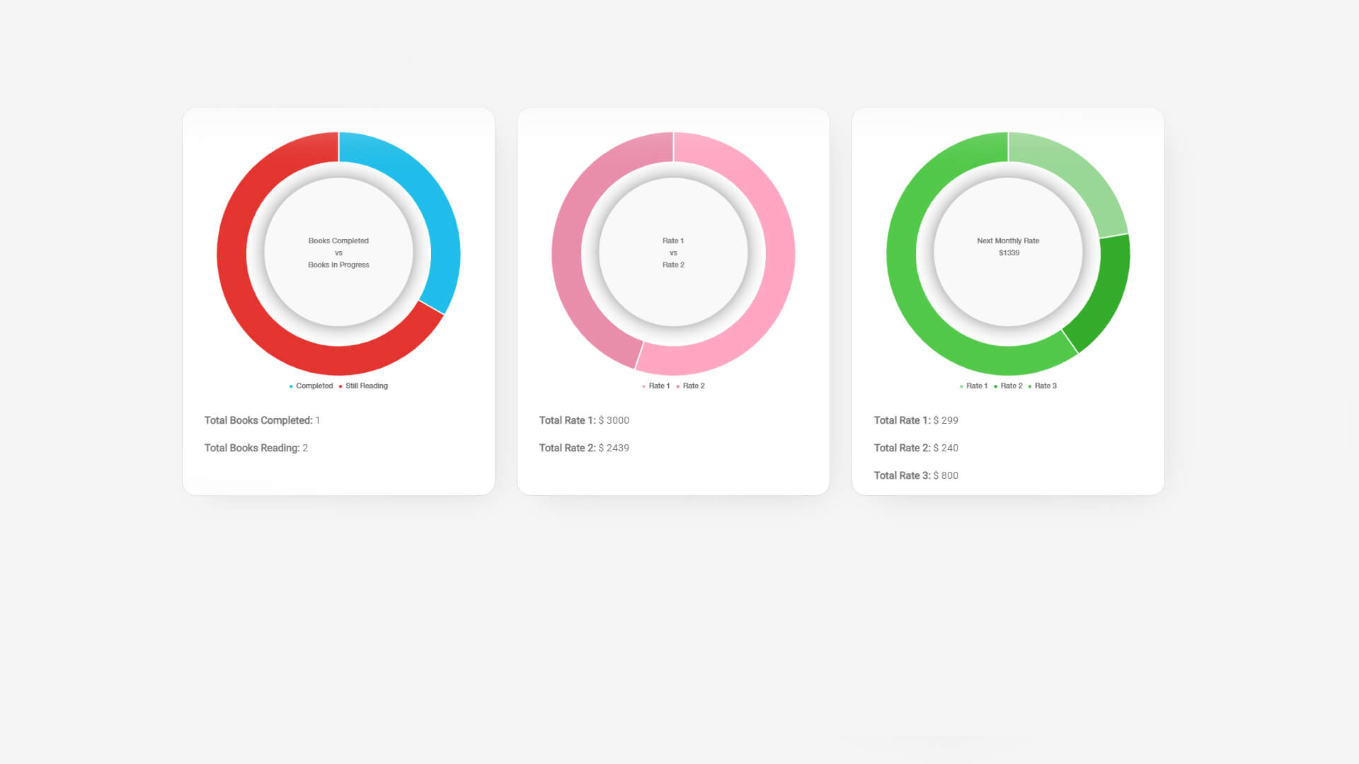
Of course, you don’t necessarily need to include all of the code above, since every project might have a different design. Let me briefly explain what each additional section of code is doing.
Circle & Shadow
To ensure that a circle can be placed in the middle of the doughnut graph, we will need to draw the circle on the canvas.
DoughnutGraph.vue
 mounted() {
      var plugin = (chart)=> {

        var width = chart.chart.width;
        var height = chart.chart.height;
        var ctx = chart.chart.ctx;
        const min = Math.min(chart.chart.height, chart.chart.width);

        drawShadow((chart.chart.width/2),(chart.chart.height/2.24),(min * 0.28));
        function drawShadow(cx,cy,r){
            ctx.save();
            ctx.shadowColor='black';
            ctx.shadowBlur=10;
            //
            ctx.beginPath();
            ctx.arc(cx,cy,r,0,2 * Math.PI);
            ctx.fill();
            ctx.restore();
        }

        var innerCircleX = Math.round((width - 3) / 2);
        var innerCircleY = height / 2;

        ctx.fillStyle = '#f9f9f9';
      // ctx.fillStyle = '#106DBD';
        ctx.beginPath();
        ctx.arc((chart.chart.width/2), (chart.chart.height/2.24), (min * 0.28), 0, 2 * Math.PI);
        ctx.fill();
        ctx.restore();
        ctx.save();
}

    this.addPlugin({
        id: 'my-plugin',
        beforeDraw: plugin
    })
Var width, height and ctx is used to define the variables, which determines the location and creation of the circle. By using ctx.arc((chart.chart.width/2), (chart.chart.height/2.24), (min * 0.28), 0, 2 * Math.PI);, we are ensuring that the circle is staying in the centre of the graph and that it stays in the position when testing responsiveness.
The drawShadow function is also using a similar method that would ensure that it stays in the centre and draws a shadow. Placing this function on top of the circle code allows the shadow to be behind the drawn circle.
I previously mentioned that you can add text in the centre of the circle. This is made possible with with the graphText prop, which can be easily spotted in the parent component. This section of code allows you to display text above the drawn circle we previously discussed.
var fontSize = (height / 324).toFixed(2);
        ctx.font = fontSize + "Roboto";
        ctx.textBaseline = "middle";

        var text = this.graphText;
        ctx.textAlign = "center";

        var textX =  Math.round((width - ctx.measureText(text).width) / 2);
        var textY = Math.round((height - ctx.measureText(text).height) / 2);
        var lineheight = 20;
        var lines = text.split('\n');

        for (var i = 0; i
You will also need to determine the size of the text and font-family. This is how we ensure that custom text can be added to each component without having the same text on all three components.
The text’s position is determined by the value of the canvas’s width and height, using a similar method used by the circle and shadow.
Graph Percentage & Label Position
There will be some cases where your graph’s legend and tooltip need to match a client’s vision. The following code is used to determine the position of your legend and the displaying of the graph’s tooltip:
</p>
<pre class="line-numbers">
this.renderChart(this.data, {
        borderWidth: "10px",
        hoverBackgroundColor: "red",
        hoverBorderWidth: "10px",
        cutoutPercentage: "75",
        tooltips: {
            callbacks: {
                label: function(tooltipItem, data) {
                    var dataset = data.datasets[tooltipItem.datasetIndex];
                var total = dataset.data.reduce(function(previousValue, currentValue, currentIndex, array) {
                    return previousValue + currentValue;
                });
                var currentValue = dataset.data[tooltipItem.index];
                var precentage = Math.floor(((currentValue/total) * 100)+0.5);
                return data['labels'][tooltipItem['index']] + ': ' + precentage + "%";
                }
            }
        },
        legend: {
            display: true,
            position: 'bottom',
            align: 'center',
            fullWidth: true,
            reverse: false,
            weight: 1000,
            labels: {
                usePointStyle:true,
                boxWidth: 5,
            }
        }
    });
</pre>
<p>
As already discussed, the DoughnutGraph component is responsible for the graph’s functionality and appearance.
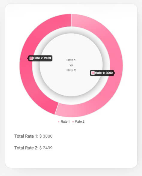
The tooltip property is responsible for displaying the graph’s data value. In some examples, like Chart.js’s Doughnut Graph, you will see that the tooltip is displaying the actual data value.
I hope that this tutorial aids you in your coding journey.
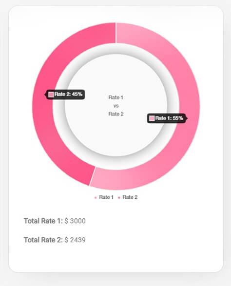
In the code above, you will see that the graph is displaying the data in percentages. That code is used to calculate the percentage of the total amount of the data in comparison with the other data value and convert the actual value into a percentage value.
The legend property is used to change the appearance of the legend and where it’s position should be. You can play around with the code and see what is to your liking.
I hope that this tutorial aids you in your coding journey.


