





There are seven main principles of design. These principles allow for a visually pleasing design. They are, in no particular order, alignment, proportion, balance, contrast, hierarchy, repetition, and white space. Neither one is more important than the next. These are lifesavers when creating a new or redesigning an old website. Personally, if I’ve hit a blank when creating a new website, I just apply these seven principles, and I find myself are more than halfway there in coming up with a design.
Let’s have a more in-depth look at each principle.
1. Alignment
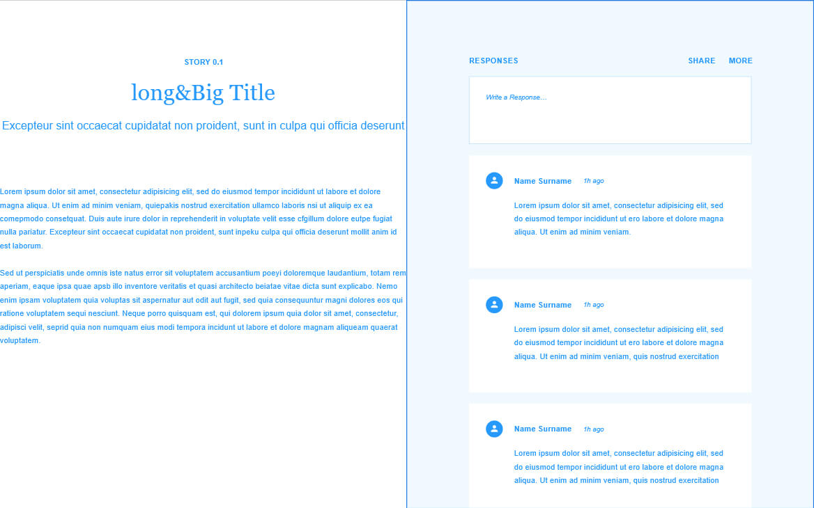
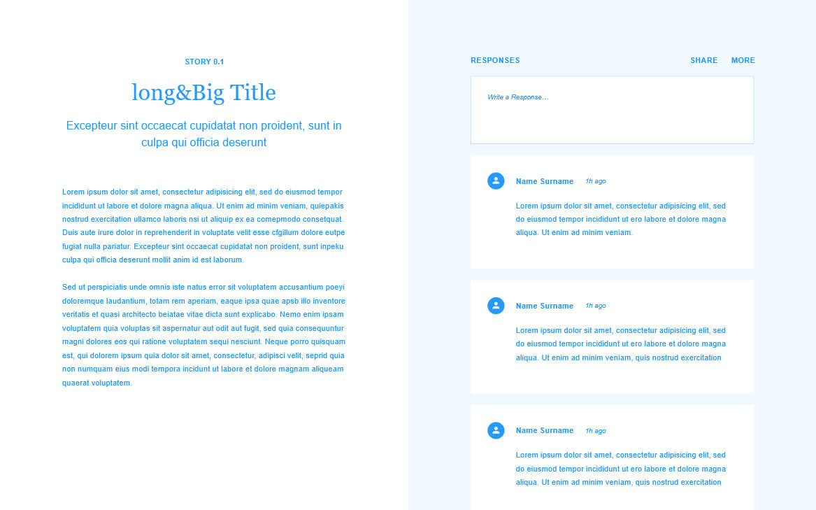
This refers to how elements align on a web page. Alignment allows elements to be grouped together or even create uniformity on the web page. Websites are effectively made up of boxes. Everything is a box. If these boxes don’t line up, it can leave the user with an unpleasant experience which could have them ultimately leaving the website.
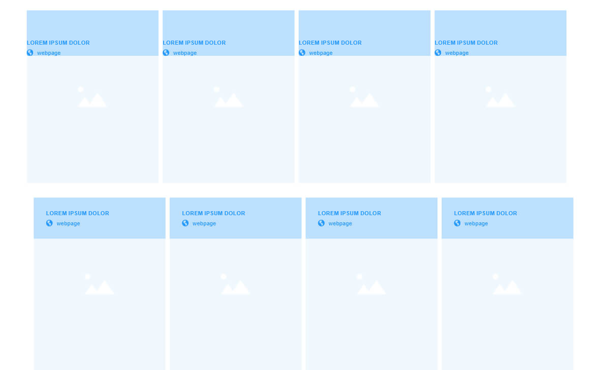
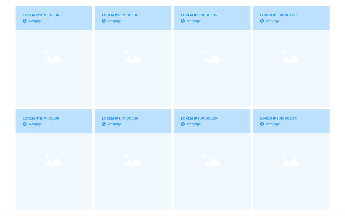
2. Proportion
Simply put, proportion, or scale, is the size of objects or elements relative to each other. As a web designer, you constantly need to think about many things. An example of this is the size of fonts relative to the size of the web page. Can people read it? Is it too small? Is it too big? Does it fit in the container I put it in?
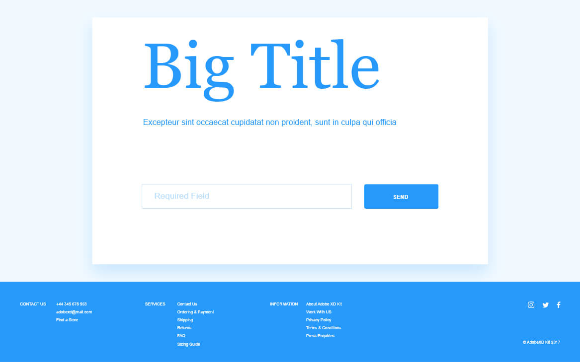
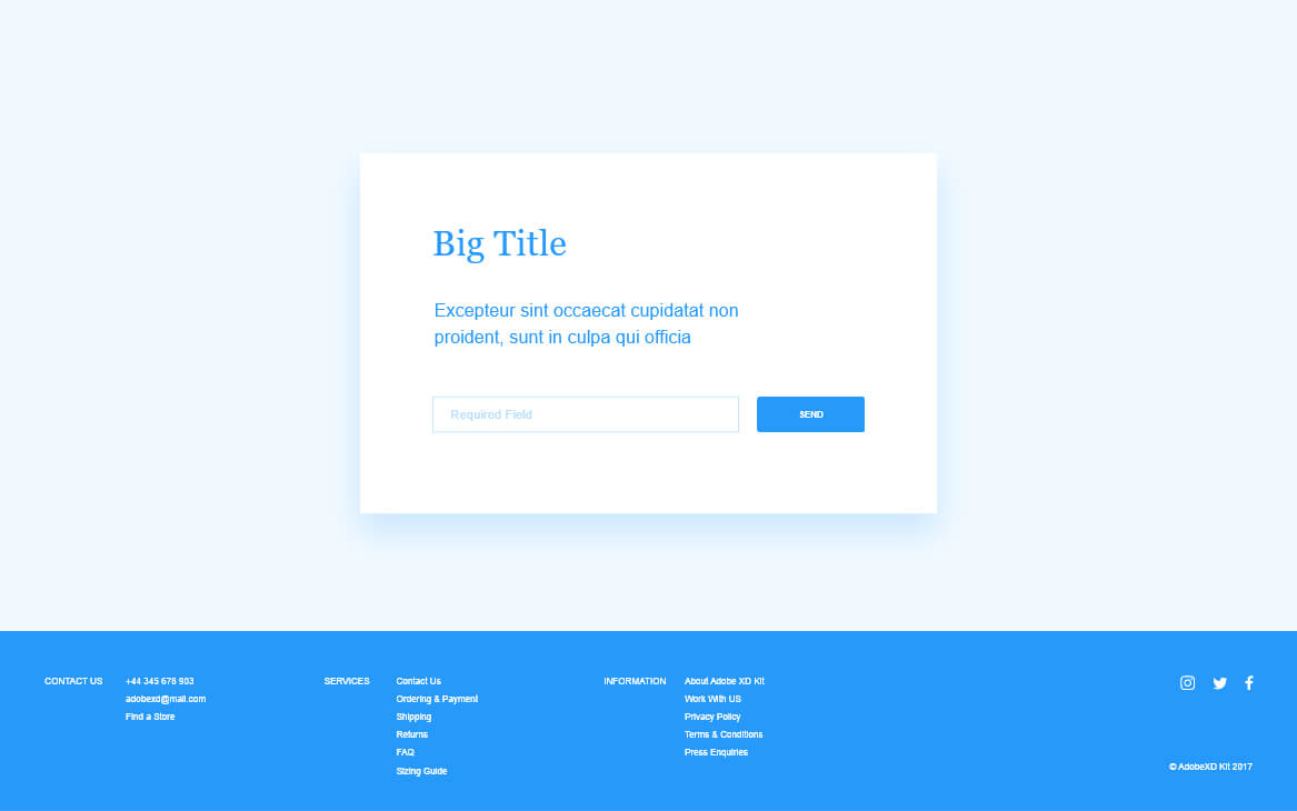
3. Balance
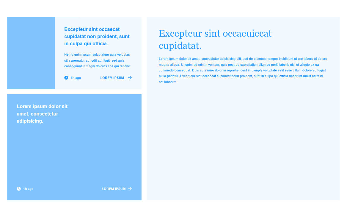
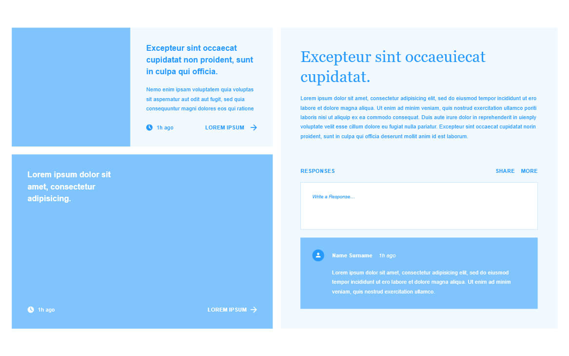
Balance is the equal positioning of objects or elements on a webpage. The human eye creates an invisible vertical line down a webpage that determines visual balance. Balance can be anything from colour, shapes, images, space and texture. This does not mean a webpage needs to be 50% equal on the left and right sides. It could be 1/3 and 2/3 but each side is equally balanced out using different elements like text, icons, or images.
4. Contrast
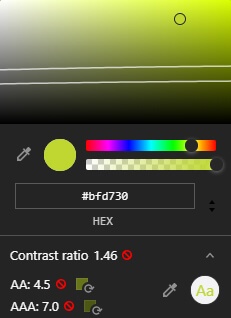
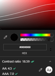
Contrast on a website is basically the contrast in colour between a foreground and a background colour. The Web Content Accessibility Guidelines (WCAG) has specifically created a colour standard for people with visual disabilities. There are three main contrast ratio:
WCAG 2.0 AA
WCAG 2.1 AA
WCAG AAA
This is a contract ration of 7:1. It is suited for people with 20/80 vision that have a loss in contrast sensitivity.
For example, a red text on a grey background will be very difficult, even for most of us without visual impairments, to see the text. This would fail the WCAG minimum. On the other hand, black text on a white background would be very easy to see for anyone.
Now the inspect tool makes it super easy to get this right.
5. Heirarchy
This refers to the order of importance in which elements are placed. An easy way to think of this is to put the most important element first, and then a lesser important element next and the least important element last.
Visual hierarchy can also refer to the font size of headings. Your most important heading should be the biggest in size. Secondary headings should be smaller than the main heading and so on. This can go further into colours. Brighter colours should have greater importance than muted or toned down colours.
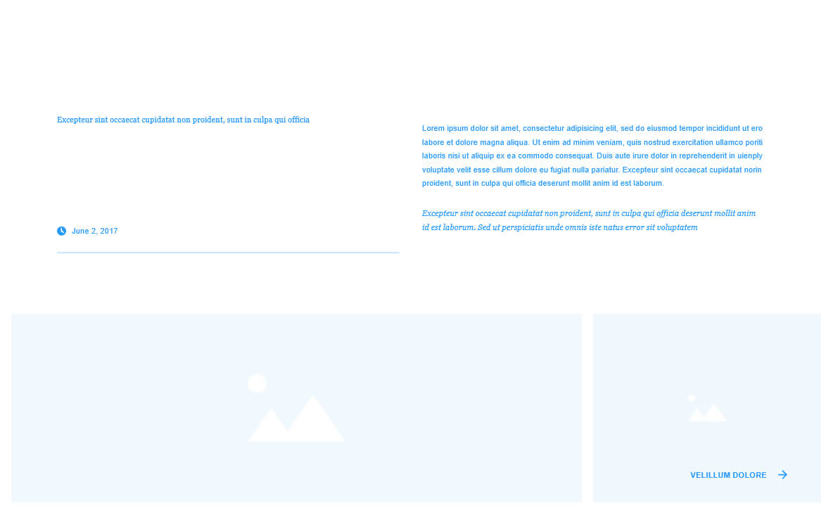
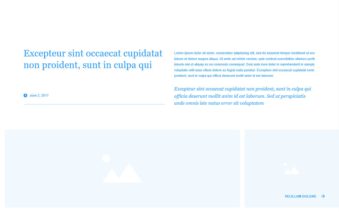
6. Repetition
Reptetion goes hand-in-hand with consistancy. This could be anything from repeating colours, font sizes, shapes, icon types and styles etc. It is very important to repeat elements throughout a website.
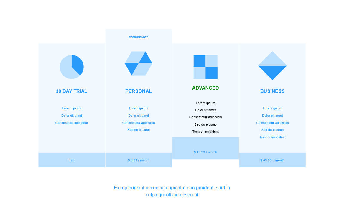
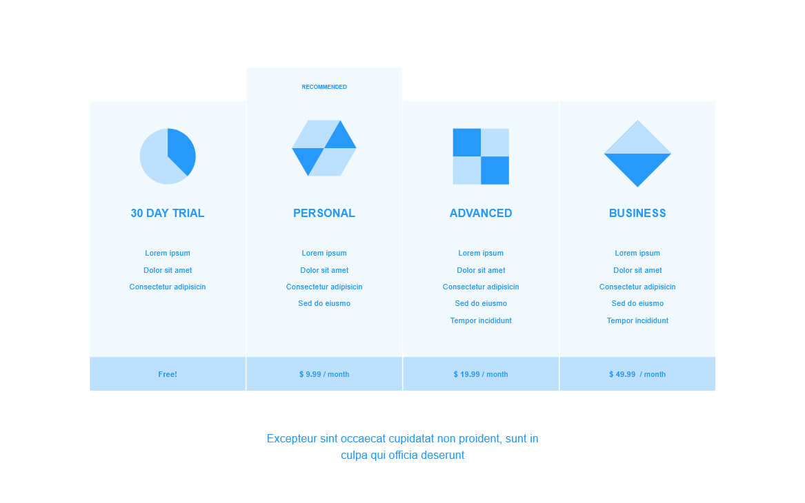
7. White Space
For me, one of the most common mistakes I see on websites today, probably has to be white space. Now, white space does not necessarily mean space that is white. It could be any colour for that matter. White space just refers to how much space “padding” is there to “breath” around an element.
Conclusion
Although some of these examples might seem obvious at first, when building a website or webpage sometimes it can be difficult to spot mistakes. Applying these design principles can make you stand out from the rest in almost any field of design or development. It took me a few years to get this right, heck I’m still learning and perfecting my craft.
https://cantunsee.space/ is a excellent game to practice these design principles.


