




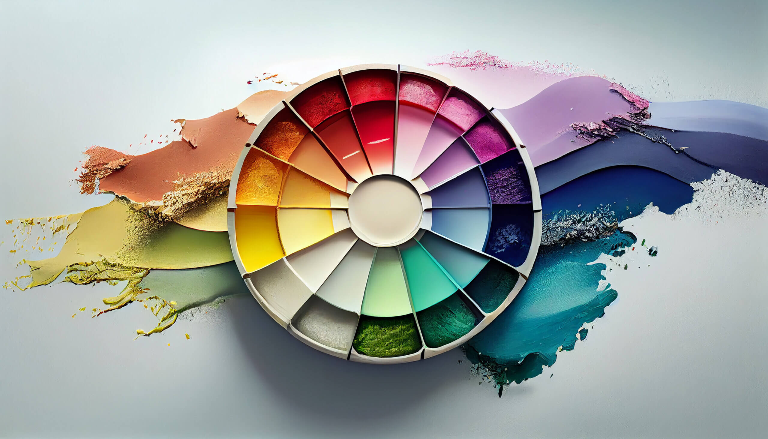
Welcome to our colourful journey through the world of design! As a graphic designer, I understand the impact that colours can have on emotions, perceptions, and user experiences. In this blog, we’ll delve into the art of creating beautiful and harmonious colour palettes, exploring the depths of colour psychology and its influential role in design.
The Power of Colour Psychology
Understanding the psychological effects of colours is crucial for crafting designs that resonate with your audience. Here’s a glimpse into the emotions commonly associated with different colours:
- Red: Energetic, passionate, and attention-grabbing.
- Blue: Calm, trustworthy, and often associated with professionalism.
- Green: Refreshing, natural, and symbolizes growth.
- Yellow: Optimistic, energetic, and attention-grabbing.
- Purple: Luxurious, creative, and associated with sophistication.
- Orange: Vibrant, friendly, and invokes a sense of enthusiasm.
- Black: Elegant, powerful, and timeless.
- White: Clean, pure, and often associated with simplicity.
Crafting Harmonious Colour Palettes
Creating a harmonious colour palette involves careful consideration of colour relationships. Here are some tips from a graphic designer’s perspective:
- Analogous Colours: Select colours that are adjacent to each other on the colour wheel for a cohesive and soothing palette. For example, combining various shades of blue and green.
- Complementary Colours: Use colours that are opposite each other on the colour wheel to create a bold and dynamic contrast. For instance, pairing red with green or blue with orange.
- Monochromatic Palette: Stick to variations of a single colour for a clean and sophisticated look. This is great for conveying a sense of unity and simplicity.
- Triadic Colours: Choose three colours evenly spaced around the colour wheel to create a vibrant and balanced palette. Ensure the colours have similar intensity to maintain harmony.
Mood-Based Colour Palettes
Different moods and purposes call for distinct colour schemes. Let’s explore a few examples:
- Calm and Tranquil: Soft blues, greens, and muted purples can evoke a sense of peace and serenity, ideal for wellness or meditation apps.
- Energetic and Dynamic: Bright and bold combinations of red, orange, and yellow are perfect for designs that aim to grab attention and convey enthusiasm.
- Sophisticated and Elegant: A monochromatic palette of blacks, greys, and whites exudes sophistication, making it suitable for luxury brands or formal events.
Conclusion
As a graphic designer, I have the privilege of using colours as my artistic palette, influencing emotions, perceptions, and user experiences. By understanding the psychology behind colours and employing thoughtful colour palettes, we can create designs that not only visually appeal but also resonate with the intended audience. So, let’s continue to paint the world with the hues of creativity and emotion!


