With a wide variety of different screen sizes, people often get screen size, resolution size, and display size mixed up or confused. So I am here to clarify and make things similar by ironing out the differences between the three sizes. As a web designer, understanding this and knowing the difference is crucial for responsive web design.
Screen size (viewport)
Most commonly used for CSS to allow web designers and web developers to create mobile friendly webpages.. It usually includes the most common and standardised viewport sizes. Measurements are usually in points. They are also proportionally smaller than resolution sizes.
To get a comprehensive list of all viewport sizes and breakpoints, click here. If you can’t find the size you are looking for click here to find your own.
Desktops & Laptops
1024×768 pixels or higher
Apple Products
iPhone
iPhone XR – 414 x 896
iPhone XS – 375 x 812
iPhone XS Max – 414 x 896
iPhone X – 375 x 812
iPhone 8 Plus – 414 x 736
iPhone 8 – 375 x 667
iPhone 7 Plus – 414 x 736
iPhone 7 – 375 x 667
iPhone 6 Plus/6S Plus – 414 x 736
iPhone 6/6S – 375 x 667
iPhone 5 – 320 x 568
iPod
iPod Touch – 320 x 568
iPad
iPad Pro – 1024 x 1366
iPad Third & Fourth Generation – 768 x 1024
iPad Air 1 & 2 – 768 x 1024
iPad Mini 2 & 3 – 768 x 1024
iPad Mini – 768 x 1024
Android Devices
Phones
Nexus 6P – 412 x 732
Nexus 5X – 412 x 732
Google Pixel 4 XL – 412 x 869
Google Pixel 4 – 412 x 869
Google Pixel 3a XL – 412 x 824
Google Pixel 3a – 412 x 846
Google Pixel 3 XL – 412 x 847
Google Pixel 3 – 412 x 824
Google Pixel 2 XL – 412 x 732
Google Pixel XL – 412 x 732
Google Pixel – 412 x 732
Samsung Galaxy Note 10+ – 412 x 869
Samsung Galaxy Note 10 – 412 x 869
Samsung Galaxy Note 9 – 360 x 740
Samsung Galaxy Note 5 – 480 x 853
LG G5 – 480 x 853
One Plus 3 – 480 x 853
Samsung Galaxy S9+ – 360 x 740
Samsung Galaxy S9 – 360 x 740
Samsung Galaxy S8+ – 360 x 740
Samsung Galaxy S8 – 360 x 740
Samsung Galaxy S7 Edge – 60 x 640
Samsung Galaxy S7 – 360 x 640
Tablets
Nexus 9 – 768 x 1024
Nexus 7 (2013) – 600 x 960
Pixel C – 900 x 1280
Samsung Galaxy Tab 10 – 800 x 1280
Chromebook Pixel – 1280 x 850
Resolution
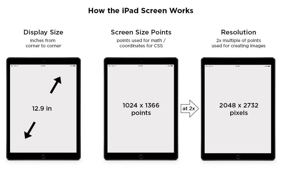
Resolution is the number of pixels displayed on the screen. Measurement is usually in pixels.
Display size
Display size is measured in a diagonal line from the top of one corner of the screen to the adjacent bottom corner of the screen. These measurements are usually in inches.
The image below perfectly describes how the three different sizes differ from one another.