





Ion-custom-form-builder
This is an ionic-angular component library for building forms with the highlight of doing form validation so you don’t have to.
Find this component library on Github
Features (Current Version)
- Email Validation
- Password Validation
- Credit Card Validation (With support for detecting card type)
- Set Success or Error Validation Colors
- Set errors to specific fields
- Inline Form Fields
- Text Area Form Fields
- Use Official Ionic Icons
Usage Example Output
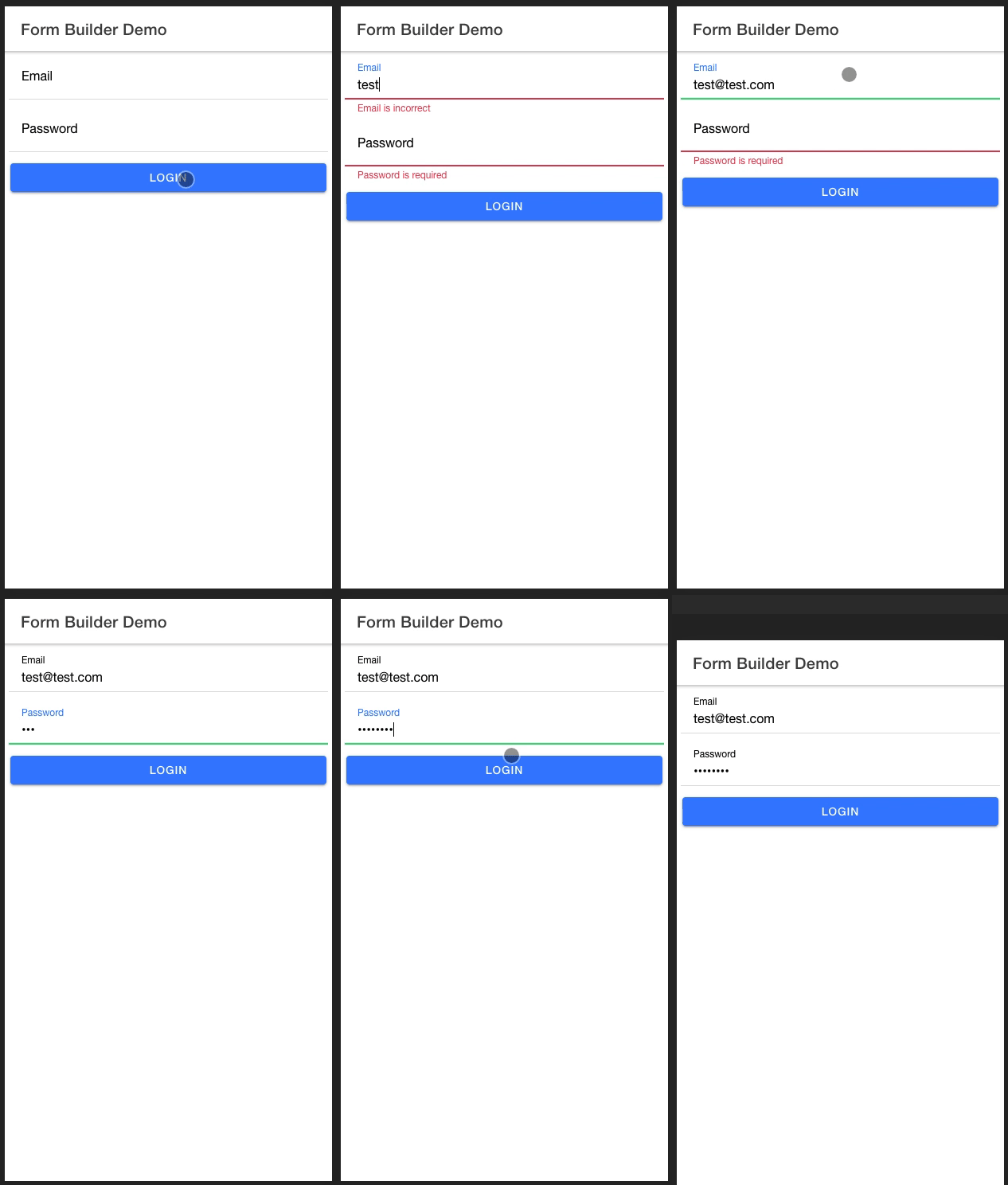
Installation
In your project root, run
npm i ion-custom-form-builder@latest
Usage Example
Lets walk through a getting started example that will show you how to setup the component in your project
import the module in your top level *.module.ts file
...
import { IonCustomFormBuilderModule } from 'ion-custom-form-builder';
...

@NgModule({
  imports: [
    ...
    IonCustomFormBuilderModule.forRoot()
    ...
  ]
})

...
Now in your *.page.html file add
...
  <ion-custom-form-builder
    [formFields]="fields"
    [submitButtonText]="'Submit'"
    (formSubmission)="submitForm($event)"
  >
  </ion-custom-form-builder>
...
Head over to your *.page.ts file and add
  ...
  import { FormField } from 'ion-custom-form-builder';
  import { AbstractControl, Validators } from '@angular/forms';
  ...

  fields: FormField[] = [];
  email: AbstractControl;
  password: AbstractControl;

  constructor() {
    this.fields = [
      {
        icon: 'mail',
        type: 'email',
        title: 'Email',
        formControlName: 'email',
        control: this.email,
        validators: [Validators.required]
      },
      {
        icon: 'lock',
        type: 'password',
        title: 'Password',
        formControlName: 'password',
        control: this.email,
        validators: [Validators.required]
      }
    ];
  }

  submitForm(formData) {
    console.log('FORM_DATA=,', formData);
  }

  ...
The FormField interface has the following structure with some important notes
/*
* icon: ion-icon name
*
* title: Form field label
*
* formControlName: Used to identify the field by angular form builder
*
* control: Form field controller holds form input data
*
* validators: An array of validators ie [Validators.required, Validators.minLength(10) . . ] full list of form validators in angular docs
*
* type: i.e <input type="text"> | support 'email', 'number', 'password', 'text', 'tel'
*
* placeholder: form field placeholder
*
* formFieldValue: preset formField value
*
* formFieldType: Current version supports 'inline' and 'textarea'
*
* textAreaRowCount: The height in rows if formFieldType === 'textarea'
*
* errors: A boolean for whether or not form field has additional errors apart from validation errors i.e errors applied on a network callback
*
* labelPosition: supported => 'floating', 'stacked', 'fixed'
*/
export interface FormField {
    icon?: string;
    title: string;
    formControlName: string;
    control: AbstractControl;
    validators: Validators[];
    type: string;
    placeholder?: string;
    formFieldValue?: string;
    formFieldType?: string;
    textAreaRowCount?: number;
    errors?: boolean;
    labelPosition?: string;
}
Css Styling
By default the form builder component has the following css classes applied on Success or Error Validations
.default-form-input {
  border: 1px solid #007bff;
  border-radius: 0.5rem;
  margin-top: 16px;
  width: 80%;
}

.default-form-input-error {
  border: 1px solid #dc3545;
}

.default-form-input-success {
  border: 1px solid #28a745;
}
In order to get your own colors on Success or Error Validations, you can override the defaults by placing your css classes in the global.scss file
IMPORTANT
Use the following rules when you override the css classes
If you override any of the classes, you have to include all the original class properties and set them as important
e.g
.override-default-form-input{
  border: 1px solid your_new_color !important;
  border-radius: your_new_border_radius !important;
  margin-top: your_new_border_margin !important;
  width: your_new_border_width !important;
}
For success and error classes, only override the border class property
NOTE
You can use your own custom made css that does not follow the above structure to style the form fields since internally the DOM structure is made up of official ion-components.
In that case you do not have to override the defaults ,simply pass in your own custom css class name using one of the applying Css methods below
Applying Css Styling
Method 1: add the classes as module configuration options
...
import { IonCustomFormBuilderModule } from 'ion-custom-form-builder';
...

@NgModule({
  imports: [
    ...
    IonCustomFormBuilderModule.forRoot({
      defaultCssClass: 'override-default-form-input',
      errorCssClass: 'override-default-form-error',
      successCssClass: 'override-default-form-success'
    })
    ...
  ]
})
...
Method 2: Use component Inputs
...
  <ion-custom-form-builder
    [formFields]="fields"
    [submitButtonText]="'Submit'"
    [defaultCssClass]="override-default-form-input'"
    [errorCssClass]="'override-default-form-error'"
    [successCssClass]="'override-default-form-success'"
    (formSubmission)="submitForm($event)"
  >
  </ion-custom-form-builder>
...
Advanced Features
- Password Validation
- Set errors to specific fields on network calls
- Credit Card Validation
Working with passwords
Usage Example Output
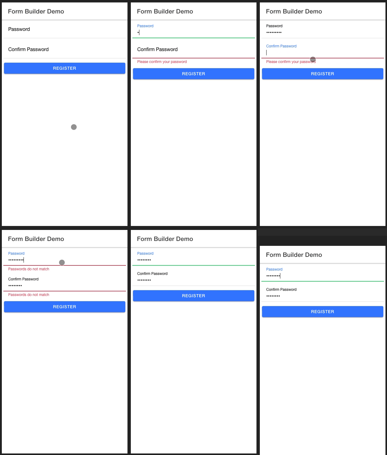
The ion-form-builder component provides you with an elegant way to validate passwords by doing the following
Password Validation Usage Example
Head over to your *.page.ts file and add
For this work you need to explicitly use password and confirm_password as your fromControlName & AbstractControl variable name
  ...
  import { FormField } from 'ion-custom-form-builder';
  import { AbstractControl, Validators } from '@angular/forms';
  ...

  fields: FormField[] = [];
  password: AbstractControl;
  confirm_password: AbstractControl;

  constructor() {
    this.fields = [
      {
        icon: 'lock',
        type: 'password',
        title: 'Password',
        formControlName: 'password',
        control: this.password,
        validators: [Validators.required]
      },
      {
        icon: 'lock',
        type: 'password',
        title: 'Confirm Password',
        formControlName: 'confirm_password',
        control: this.confirm_password,
        validators: [Validators.required]
      }
    ];
  }
  ...
Credit Card Validation
ion-custom-form-builder comes with the ability to validate credit cards thanks to Payform Library
Usage Example Output
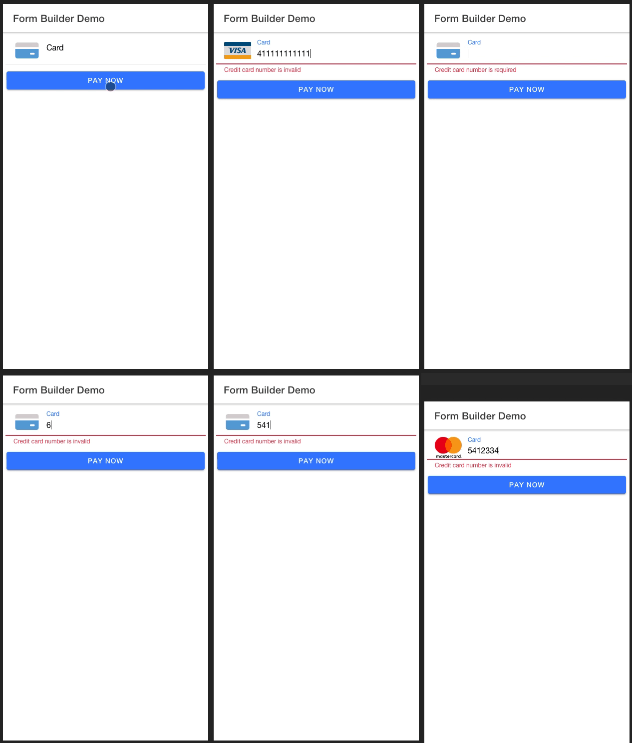
Credit Card Validation Usage Example
IMPORTANT
First you need to add the following in the assets array of your angular.json file, this will map library’s
assets to your project assets folder
  ...
  "architect": {
    "build": {
      "options": {
        "assets": [
          {
            "glob": "**/*",
            "input": "node_modules/ion-custom-form-builder/src/assets",
            "output": "assets"
          }
        ]
      }
    }
  }
  ...
in your *.page.ts file , create a FormField array object with a formFieldType of ‘card’
...
  fields: FormField[] = [];
  card: AbstractControl;

  constructor() {
    this.fields = [
      {
        type: 'number',
        title: 'Card Number',
        formControlName: 'card',
        control: this.card,
        validators: [Validators.required],
        formFieldType: 'card',
        labelPosition: 'stacked'
      }
    ];
  }
...
Serve your app again to see the changes
ionic serve
Set Errors to Specific Fields
Scenario
Say you are working on a login form and you want to set errors to your form fields when the user has entered the incorrect credentials
In your *.html file use the input [errorsIndex] that takes in an array of indices representing the index of the field to which you want to set an error
...
  <ion-custom-form-builder
    [formFields]="loginForm"
    [submitButtonText]="'Login'"
    (formSubmission)="doLogin($event)"
    [errorsIndex]="loginErrors"
  >
  </ion-custom-form-builder>
...
In your *.ts file, lets assume you have some api that handles login.
Init an array loginErrors
When you encounter an error, say your api throws back a 401 error, you want to push the indices of the email and password fields into your loginErrors array
the result will be the email and password applying the error css class notifying the user that something is wrong with the login credentials
...
  loginForm: FormField[] = [];
  email: AbstractControl;
  password: AbstractControl;
  loginErrors: any[] = [];
...

  constructor(
    private api: HttpServiceProvider,
  ) {
    this.loginForm = [
      {
        icon: 'mail',
        type: 'email',
        title: 'Email',
        formControlName: 'email',
        control: this.email,
        validators: [Validators.required]
      },
      {
        icon: 'lock',
        type: 'password',
        title: 'Password',
        formControlName: 'password',
        control: this.email,
        validators: [Validators.required]
      }
    ];
  }

  doLogin(formData) {
    this.api.login(formData).then( response => {
      // Some success logic
    }).catch( error => {
      // We know email and password fields are at index 0 and 1 respectively for the purpose of this example
      // You could have some intelligent logic to determine fields to which you want errors applied
      this.loginErrors = [0, 1];
      loader.dismiss();
    });
  }
...


