ASP.NET
January 17, 2023
Postman Mock API
January 30, 2023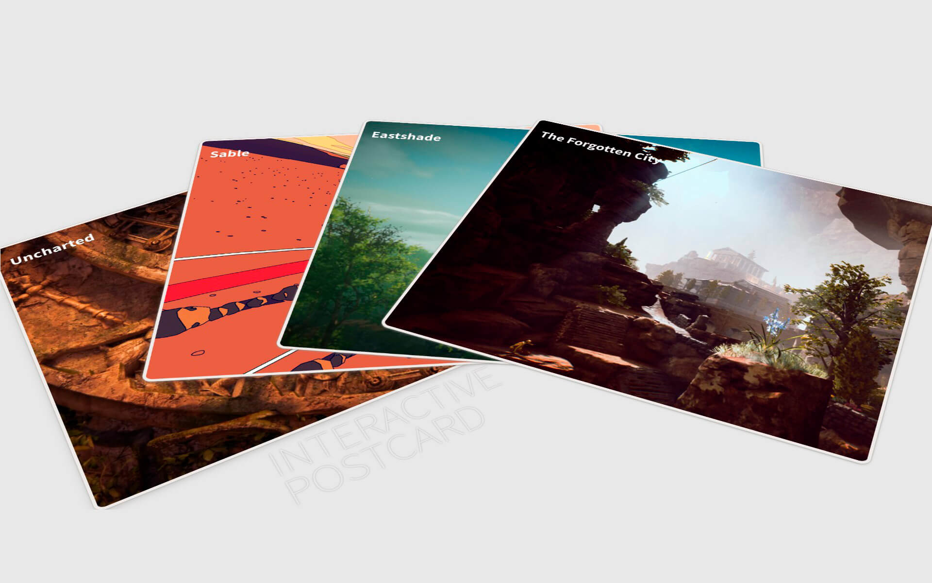
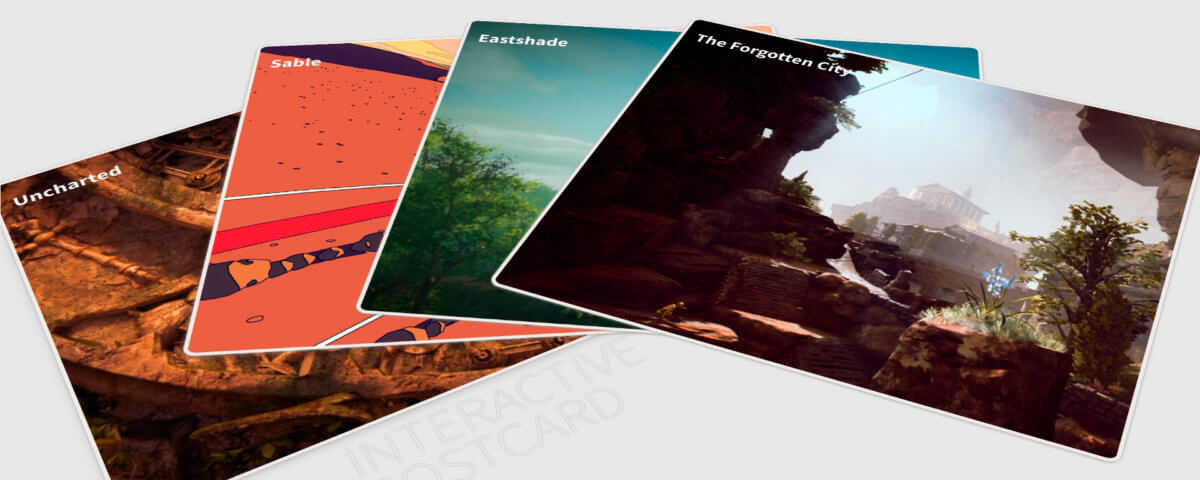
When creating a home page for a web application, it is always important to make it stand out, especially if the project in question is a portfolio website.
There are various ways on how a developer can make a website unique and aesthetically pleasing. It would involve various elements such as colour palette, website layout, specific font usage, and the implementation and positioning of UX elements.
In this blog, I will be taking you through the steps on how to implement an interactive postcard menu for a Laravel 8 Vue project.
Table of Contents
Implementing the Postcard
As the title header suggests, this section will cover on how we will be implementing the postcard. It is very important to note that this project’s code is fully inspired by Andrew Canham’s Spread cards project, which you can visit if you are interested on how the original code has been implemented.
The first we will need is to create a Vue component for our project, which in this case will be called PostcardComponent.vue. After the file has been created, we will need to add the file to the app.js file, which is located in the js folder within resources.
When the necessary code from has been added, we will need to add the component’s name to the home page:
home.blade.php
    @extends('layouts.app')

    @section('content')
      <postcard-component
        forgotten-city-url="{{ route('vp-portfolio.the-forgotten-city') }}"
        eastshade-url="{{ route('vp-portfolio.eastshade') }}"
        sable-url="{{ route('vp-portfolio.sable') }}"
        uncharted-url="{{ route('vp-portfolio.uncharted') }}"
      ></postcard-component>
    @endsection
Now that the component has been added to the home page, we can start the implement our card container and cards. By adding the following code, we are adding two containers, the main container and the card container. The main container will consist of the card container and the perspective div element, while the card container will only consist of the cards that we will interact with.
PostcardComponent.vue
<template>
    <div class="container">
        <div class="perspective">
            <div class='card-container ' >
                <div class="message">
                    INTERACTIVE POSTCARD
                </div>
                <div class='card card-card1'>
                    <div class='card__face card__face--top '>

                    </div>
                </div>
                <div class='card card-card2'>
                    <div class='card__face card__face--top'>

                    </div>
                </div>
                <div class='card card-card3'>
                    <div class='card__face card__face--top'>

                    </div>
                </div>
                <div class='card card-card4'>
                    <div class='card__face card__face--top'>

                    </div>

                </div>
            </div>
        </div>
    </div>
</template>
After the template code has been implemented, we will need to implement the styling for the cards in order for it to properly display. As you will see in the code below, we will be positioning the cards in a manner that they will be on top of one another when accessing the page. In the next section, we will go over how we reveal them.
app.scss
// Bootstrap
@import "~bootstrap/scss/bootstrap";

// Variables
@import "base/typography";

@import "component/btn";
@import "component/card-menu";
@import "component/form";
@import "component/header";
@import "component/modal";
@import "component/postcard";
@import "component/link";

@import "layout/nav-bar";
@import "layout/footer";

@import "component/datatable";

#app {
    overflow: visible;
  }

html,body
{
  width: 100%;
  height: 100%;
  margin: 0px;
  padding: 0px;
  overflow-x: hidden;
}

.fa {
  display: initial;
}

.auth-pages{
  background-color: #FFFFFF;
}

input:focus, textarea:focus, select:focus{
  outline: none;
}

textarea:focus{
  height: 99px!important;
  max-height: 150px!important;
}

body {
  background: #e7e7e7;
  font-family: 'Source Sans Pro', sans-serif;
  font-weight: 200;
  font-size: 1.4rem;
  height: 100vh;
  overflow: hidden;
  width: 100vw;
}
_postcard.scss
@import url('https://fonts.googleapis.com/css?family=Source+Sans+Pro:200,300,400,700,900');

.message {
    color: #e7e7e7;
    text-shadow: 0 0 3px #b4b4b4;
    font-size: 70px;
    font-weight: 200;
    letter-spacing: -0.01em;
    line-height: 60px;
    position: absolute;
    transform: rotate(-31deg) translate3d(-64%, 532%, 0);
    width: 7em;
}

.card {
  background: #eeeae7;
  border-radius: 16px;
  box-shadow: 0 1px 2px 0 rgba(151,150,146,0.4);
  height: 43vw;
  max-height: 60vw;
  max-width: 80vw;
  min-height: 25vw;
  min-width: 16vw;
  position: absolute;
  transition: all ease-in 0.3s;
  width: 50vw;
  -webkit-touch-callout: none;
  -webkit-user-select: none;
  -khtml-user-select: none;
  -moz-user-select: none;
  -ms-user-select: none;
  user-select: none;
}

.card-card1 {
  box-shadow:
    0 1px 2px 0 rgba(151,150,146,0.4),
    0 4px 12px 0 rgba(151,150,146,0.4)
    ;
  color: #635f5c;
  .card__value {
    transform: translatex(-2px);
  }
}
.card-card2 {
  color: #a68385;
  .card__value {
    transform: translatex(-2px);
  }
  .card__suit {
    margin-top: 0.8rem;
  }
}

.card-card3 {
  color: #635f5c;
  .card__value {
    transform: translatex(-2px);
  }
  .card__suit {
    margin-top: 0.8rem;
  }
}
.card-card4 {
  color: #a68385;
  .card__value {
    transform: translatex(-2px);
  }
  .card__suit {
    margin-top: 0.7rem;
  }
}

.card__face {
  padding: 1.8rem 1.6rem;
  position: absolute;
}
.card__face--btm {
  bottom: 0;
  right: 0;
  transform: rotate(180deg);
}
.card__value {
  display: block;
  text-align: left !important;
  width: 18vw !important;
  height: 5vw!important;
  font-size: 30px;
  font-weight: bold;
}
.card__suit {
  display: block;
  margin-top: 0.5rem;
}

div.perspective {
  height: 100vh;
  perspective: 2000px;
  position: absolute;
  width: 100vw;
}
.card-container {
  cursor: pointer;
  left: 31%;
  position: absolute;
  top: 15%;
  transform: rotateX(50deg) translate3d(-50%, -50%, 0);
  height: 45vw;
  width: 32vw;
  max-height: 450px;
  max-width: 320px;
}

// Positioning of the Cards
.card-card1 {
  transform: rotate(-31deg) translate3d(-50%, -10%, 0);
}
.card-card2 {
  transform: rotate(-31deg) translate3d(-49.5%, -10.5%, 0);
}
.card-card3 {
  transform: rotate(-31deg) translate3d(-49%, -11%, 0);
}
.card-card4 {
  transform: rotate(-31deg) translate3d(-48.5%, -11.5%, 0);
}
Adding Animation and Links for Postcard
Now that we have our cards setup, we will now need to implement code that will allow for the cards to change position when the user interacts with them. In the following example, we will be implementing the .card-container.spread class, which will be used to smoothly change the cards’ default position.
_postcard.scss
...
// Repositions the cards when clicking them
.card-container.spread {
  .card-card1 {
    transform: rotate(-31deg) translate3d(-50%, -10%, 0);
    box-shadow:
      0 1px 2px 0 rgba(151,150,146,0.4),
      0 4px 12px 0 rgba(151,150,146,0.4)
      ;
  }
  .card-card2 {
    transform: rotate(-4.5deg) translatex(-22%);
    box-shadow:
      0 1px 2px 0 rgba(151,150,146,0.4),
      0 2px 6px 0 rgba(151,150,146,0.4)
      ;
  }
  .card-card3 {
    transform: rotate(5.8deg) translatex(10%);
    box-shadow:
      0 1px 2px 0 rgba(151,150,146,0.4),
      0 2px 4px 0 rgba(151,150,146,0.4)
      ;
  }
  .card-card4 {
    transform: rotate(22.5deg) translate3d(40%, -5%, 0);
    box-shadow:
      0 1px 2px 0 rgba(151,150,146,0.4),
      0 2px 4px 0 rgba(151,150,146,0.4)
      ;
  }
}
Now that have implemented the necessary class for the animation, we will now need to implement a toggle class function on the Vue component. First, we will need to add v-bind:class="[isSpread ? 'spread' : '']" to the card container and then add @click="toggleClass()" afterwards.
By adding these two snippets of code, we added a way for the spread class to be added to the card container when the user clicks on the card. We will then proceed to add the toggleClass method the PostcardComponent’s script and have a isSpread prop to determine if the value is true or false. The code should look like the following:
PostcardComponent.vue
<template>
    <div class="container">
        <div class="perspective">
            <div class='card-container ' v-bind:class="[isSpread ? 'spread' : '']" @click="toggleClass()">
                <div class="message">
                    INTERACTIVE POSTCARD
                </div>
                <div class='card card-card1'>
                    <div class='card__face card__face--top '>

                    </div>
                </div>
                <div class='card card-card2'>
                    <div class='card__face card__face--top'>

                    </div>
                </div>
                <div class='card card-card3'>
                    <div class='card__face card__face--top'>

                    </div>
                </div>
                <div class='card card-card4'>
                    <div class='card__face card__face--top'>

                    </div>

                </div>
            </div>
        </div>
    </div>
</template>

<script>
    export default {
        props: {
            isSpread: {
                type: Boolean,
                default: false
            },

            forgottenCityUrl: String,
            eastshadeUrl: String,
            sableUrl: String,
            unchartedUrl: String,
        },

        data: function () {
            return {
                mutableList: JSON.parse(this.isSpread)
            }
        },


        methods: {
            toggleClass: function(event){
               this.isSpread = !this.isSpread;
            },
        }
    }
</script>
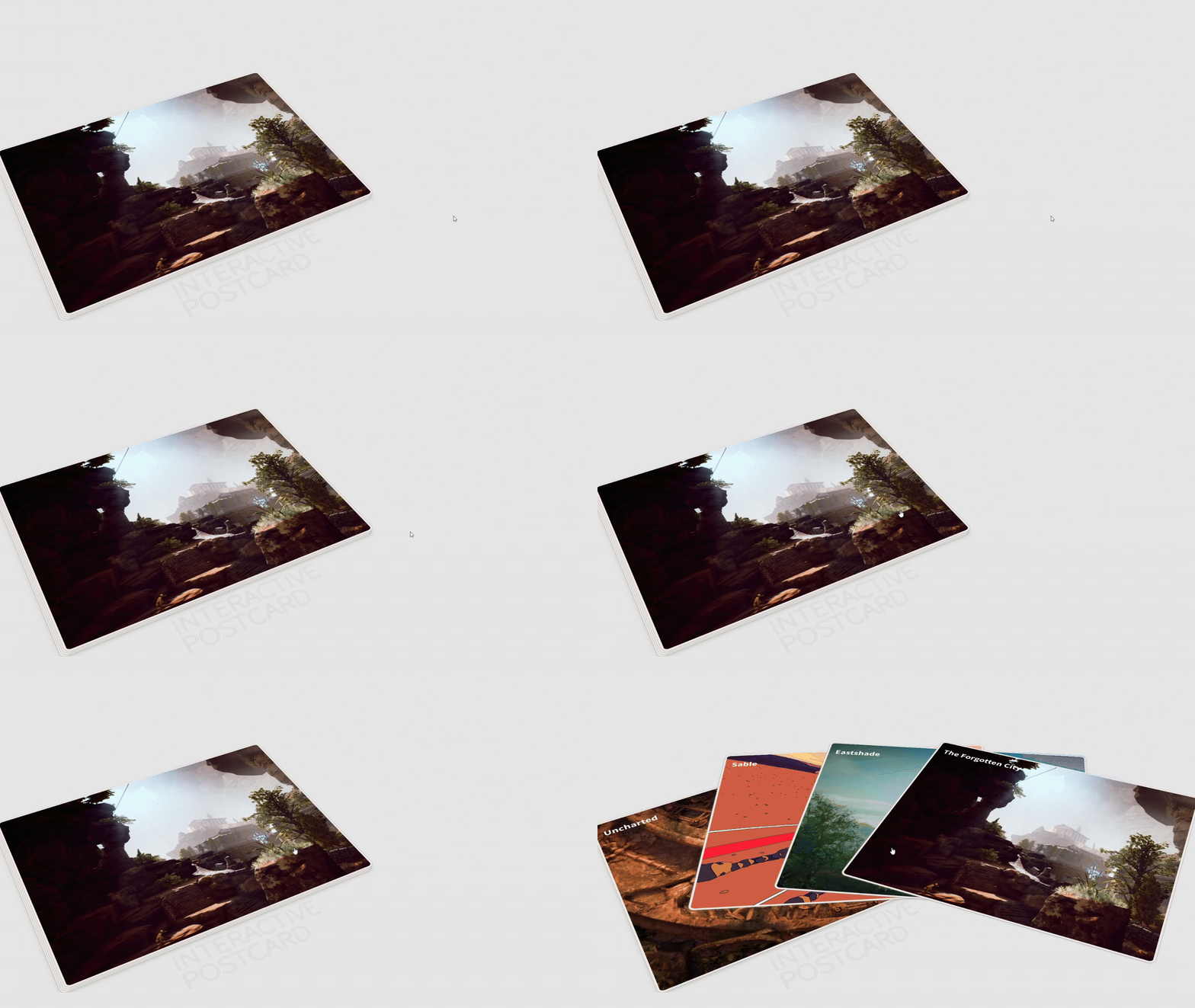
After implementing the code, you will see that the cards are being spread out. You can of course change the positioning and animation of the cards to whatever your heart desires, but for the sake of simplicity, we will be using the current positioning code.
The next step would be the implementation of the page links. For projects such as portfolio websites, it is always best to capture the user’s eye. When a user interacts with the cards, they will need to be able to see the link immediately. So for that to happen, we will need to add the links like the following:
PostcardComponent.vue
<template>
    <div class="container">
        <div class="perspective">
            <div class='card-container ' v-bind:class="[isSpread ? 'spread' : '']" @click="toggleClass()">
                <div class="message">
                    INTERACTIVE POSTCARD
                </div>
                <div class='card card-card1'>
                    <div class='card__face card__face--top '>
                            <span class='card__value' v-if="isSpread" >
                                <a :href="unchartedUrl" @click="portfolioLinkClick()">Uncharted</a>
                            </span>
                    </div>
                </div>
                <div class='card card-card2'>
                    <div class='card__face card__face--top'>
                            <span class='card__value' v-if="isSpread" >
                                <a :href="sableUrl" @click="portfolioLinkClick()">Sable</a>
                            </span>
                    </div>
                </div>
                <div class='card card-card3'>
                    <div class='card__face card__face--top'>
                            <span class='card__value' v-if="isSpread" >
                                <a :href="eastshadeUrl" @click="portfolioLinkClick()">Eastshade</a>
                            </span>
                    </div>
                </div>
                <div class='card card-card4'>
                    <div class='card__face card__face--top'>
                            <span class='card__value' v-if="isSpread" >
                                <a :href="forgottenCityUrl" @click="portfolioLinkClick()">The Forgotten City</a>
                            </span>
                    </div>

                </div>
            </div>
        </div>
    </div>
</template>

<script>
    export default {
        props: {
            isSpread: {
                type: Boolean,
                default: false
            },
            isLinkClicked: {
                type: Boolean,
                default: false
            },

            forgottenCityUrl: String,
            eastshadeUrl: String,
            sableUrl: String,
            unchartedUrl: String,
        },

        data: function () {
            return {
                mutableList: JSON.parse(this.isSpread)
            }
        },


        methods: {
            toggleClass: function(event){
                if(this.isLinkClicked === false) {
                    this.isSpread = !this.isSpread;
                }
            },

            portfolioLinkClick: function(event){
                this.isLinkClicked = !this.isLinkClicked;
            }
        }
    }
</script>
_link.scss
/* CSS based from css-tricks.com article: https://css-tricks.com/css-link-hover-effects/ */

a {
    background-image: linear-gradient(
      to right,
      #54b3d6,
      #54b3d6 50%,
      rgb(255, 255, 255) 50%
    );
    background-size: 200% 100%;
    background-position: -100%;
    -webkit-background-clip: text;
    -webkit-text-fill-color: transparent;
    transition: all 0.3s ease-in-out;
  }
As you can see above, the url for each screen needs to be added to the component. You will also notice that a new method function has been added as well as an additional if statement for the toggleClass function.
The reason for these new additions is to prevent the postcard from closing when the user clicks on the link. Therefore, the if statement ensures that the cards do not change position when someone has interacted with the link.
And finally, the last step for the postcard to be completed is the adding of the desired image. To ensure that the image is consistent with a typical postcard design, we will need to add a div below the link, which will consist of the image.
PostcardComponent.vue
<template>
    <div class="container">
        <div class="perspective">
            <div class='card-container ' v-bind:class="[isSpread ? 'spread' : '']" @click="toggleClass()">
                <div class="message">
                    INTERACTIVE POSTCARD
                </div>
                <div class='card card-card1'>
                    <div class='card__face card__face--top '>
                            <span class='card__value' v-if="isSpread" >
                                <a :href="unchartedUrl" @click="portfolioLinkClick()">Uncharted</a>
                            </span>
                    </div>
                    <div class="card-image">
                        <img class="img-responsive" v-bind:src="'../images/Uncharted VP by Henlo Neethling.jpg'">
                    </div>
                </div>
                <div class='card card-card2'>
                    <div class='card__face card__face--top'>
                            <span class='card__value' v-if="isSpread" >
                                <a :href="sableUrl" @click="portfolioLinkClick()">Sable</a>
                            </span>
                    </div>
                    <div class="card-image">
                        <img class="img-responsive" v-bind:src="'../images/Sable VP by Henlo Neethling.jpg'">
                    </div>
                </div>
                <div class='card card-card3'>
                    <div class='card__face card__face--top'>
                            <span class='card__value' v-if="isSpread" >
                                <a :href="eastshadeUrl" @click="portfolioLinkClick()">Eastshade</a>
                            </span>
                    </div>
                    <div class="card-image">
                        <img class="img-responsive" v-bind:src="'../images/Eastshade VP by Henlo Neethling.jpg'">
                    </div>
                </div>
                <div class='card card-card4'>
                    <div class='card__face card__face--top'>
                            <span class='card__value' v-if="isSpread" >
                                <a :href="forgottenCityUrl" @click="portfolioLinkClick()">The Forgotten City</a>
                            </span>
                    </div>
                    <div class="card-image">
                        <img class="img-responsive" v-bind:src="'../images/The Forgotten City VP by Henlo Neethling.jpg'">
                    </div>

                </div>
            </div>
        </div>
    </div>
</template>

<script>
    export default {
        props: {
            isSpread: {
                type: Boolean,
                default: false
            },
            isLinkClicked: {
                type: Boolean,
                default: false
            },

            forgottenCityUrl: String,
            eastshadeUrl: String,
            sableUrl: String,
            unchartedUrl: String,
        },

        data: function () {
            return {
                mutableList: JSON.parse(this.isSpread)
            }
        },


        methods: {
            toggleClass: function(event){
                if(this.isLinkClicked === false) {
                    this.isSpread = !this.isSpread;
                }
            },

            portfolioLinkClick: function(event){
                this.isLinkClicked = !this.isLinkClicked;
            }
        }
    }
</script>
_postcard.scss
...
.card-image{
    overflow: hidden;
    border-radius: 2%;
    border: 5px solid #eeeae7;
}

.card-image img{
    width: 153%;
}
As you can see above, additional css code needed to be implemented to ensure that image overflow is hidden and that there would be a border surrounding the image, which makes it easier for the image to be added to the cards without having to worry about adding borders for the image.
Additional Styling
If you want to add a bit more flair to the card interaction, you can of course add additional code that changes the display of the link.
You can make the text bigger, change its colour or maybe add a hover effect to the link. Let’s take a look on what we can add further to the postcard.
As mentioned earlier, you will need to catch the user’s attention when working on this postcard interface. Naturally, that would mean we will need to add another animation to the postcard, which will be used to display the link when the user interacts with postcard. What we need to do is add the following code:
PostcardComponent.vue
<template>
    <div class="container">
        <div class="perspective">
            <div class='card-container ' v-bind:class="[isSpread ? 'spread' : '']" @click="toggleClass()">
                <div class="message">
                    INTERACTIVE POSTCARD
                </div>
                <div class='card card-card1'>
                    <div class='card__face card__face--top '>
                        <Transition name="card-title">
                            <span class='card__value' v-if="isSpread" >
                                <a :href="unchartedUrl" @click="portfolioLinkClick()">Uncharted</a>
                            </span>
                        </Transition>
                    </div>
                    <div class="card-image">
                        <img class="img-responsive" v-bind:src="'../images/Uncharted VP by Henlo Neethling.jpg'">
                    </div>
                </div>
                <div class='card card-card2'>
                    <div class='card__face card__face--top'>
                         <Transition name="card-title">
                            <span class='card__value' v-if="isSpread" >
                                <a :href="sableUrl" @click="portfolioLinkClick()">Sable</a>
                            </span>
                         </Transition>
                    </div>
                    <div class="card-image">
                        <img class="img-responsive" v-bind:src="'../images/Sable VP by Henlo Neethling.jpg'">
                    </div>
                </div>
                <div class='card card-card3'>
                    <div class='card__face card__face--top'>
                         <Transition name="card-title">
                            <span class='card__value' v-if="isSpread" >
                                <a :href="eastshadeUrl" @click="portfolioLinkClick()">Eastshade</a>
                            </span>
                         </Transition>
                    </div>
                    <div class="card-image">
                        <img class="img-responsive" v-bind:src="'../images/Eastshade VP by Henlo Neethling.jpg'">
                    </div>
                </div>
                <div class='card card-card4'>
                    <div class='card__face card__face--top'>
                          <Transition name="card-title">
                            <span class='card__value' v-if="isSpread" >
                                <a :href="forgottenCityUrl" @click="portfolioLinkClick()">The Forgotten City</a>
                            </span>
                          </Transition>
                    </div>
                    <div class="card-image">
                        <img class="img-responsive" v-bind:src="'../images/The Forgotten City VP by Henlo Neethling.jpg'">
                    </div>

                </div>
            </div>
        </div>
    </div>
</template>

<script>
    export default {
        props: {
            isSpread: {
                type: Boolean,
                default: false
            },
            isLinkClicked: {
                type: Boolean,
                default: false
            },

            forgottenCityUrl: String,
            eastshadeUrl: String,
            sableUrl: String,
            unchartedUrl: String,
        },

        data: function () {
            return {
                mutableList: JSON.parse(this.isSpread)
            }
        },


        methods: {
            toggleClass: function(event){
                if(this.isLinkClicked === false) {
                    this.isSpread = !this.isSpread;
                }
            },

            portfolioLinkClick: function(event){
                this.isLinkClicked = !this.isLinkClicked;
            }
        }
    }
</script>
_postcard.scss
...
/* Animations for Card Title transition tag */

.card-title-enter-active {
    animation: card-title-in 0.9s;
  }
  .card-title-leave-active {
    animation: card-title-in 0.9s reverse;
  }
  @keyframes card-title-in {
    0% {
      transform: scale(0);
    }
    50% {
      transform: scale(1.10);
    }
    100% {
      transform: scale(1);
    }
  }
Since we have now added the v-if for the link’s div, the link will then be hidden until the user clicks on the postcards. When the user has clicked the top card, the link will scale in and out, giving it a bit of a bounce effect when being revealed. This animation will also do the same when the user has clicked on the postcard again, which will close the postcards and hide the links. This has been made possible thanks to the Transition component. By giving the
Now that we have added an animation to the link, it would also be helpful to give the user an indication that the link is something they can interact with. For this example, we will be using a hover effect, which will change the link colour to a gradient light blue and give an underscore:
_link.scss
...

  a:before {
    content: '';
    background: #54b3d6;
    display: block;
    position: absolute;
    bottom: -3px;
    left: 0;
    width: 0;
    height: 3px;
  }

  a:hover {
    background-position: 0;
  }

   a:hover::before {
    width: 100%;
   }
And presto, you now have a postcard interface that can serve as a unique menu button.
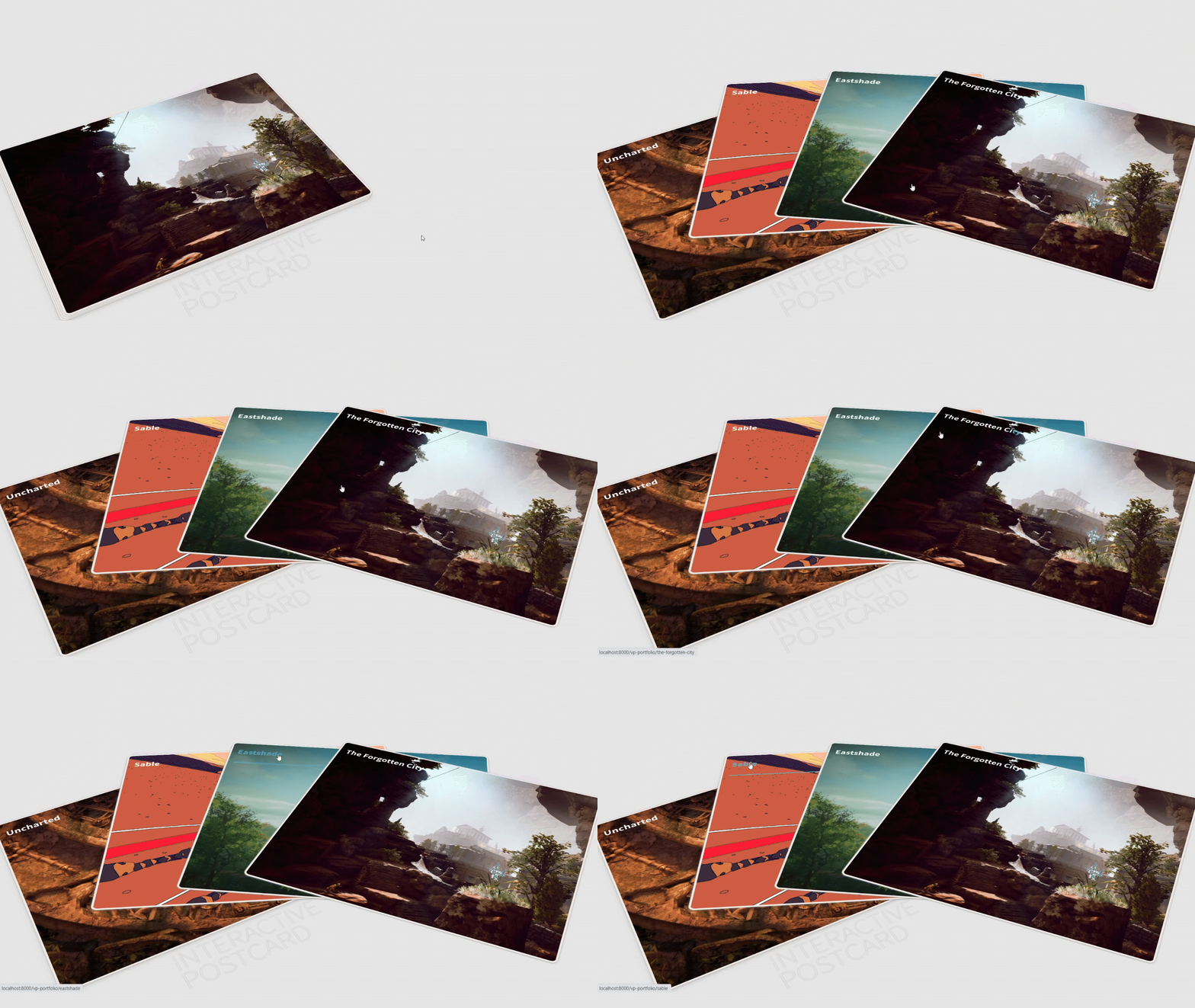
Of course, you can change the interaction, perspective, design, links and functionality of the cards however you see fit. It all depends on what project you would like to apply it for.
I wish nothing but the best for your coding projects and hope that this blog has been very helpful.


